5 Typography Hacks to Enhance Your Website's Visual Appeal
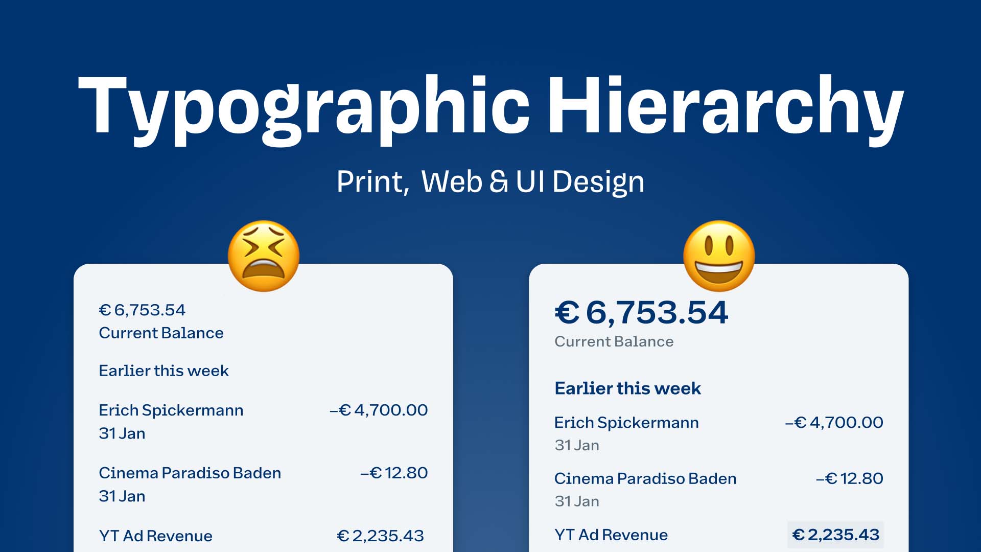
Typography plays a crucial role in enhancing your website's visual appeal, and implementing effective typography hacks can significantly improve user engagement. One of the first hacks to consider is hierarchy. By utilizing different font sizes and weights, you can create a clear distinction between headings, subheadings, and body text. This not only helps guide the reader's eye but also makes the content more digestible. Another effective hack is to choose a readable font for your website. Aim for clean, sans-serif fonts like Arial or Helvetica for body text, and reserve decorative fonts for headings or accents. This balance will ensure that your text is easy to read while adding a stylish touch to your overall design.
Incorporating ample white space is another typography hack that can enhance your site's visual appeal. White space helps to reduce clutter, allowing your text to breathe and improving overall readability. Additionally, using consistent spacing between lines, paragraphs, and elements creates a harmonious layout that keeps users engaged. Lastly, consider the contrast between your text and background colors. Ensure that your content stands out by choosing high-contrast color schemes, such as dark text on a light background. This simple yet effective tip will enhance not only the visibility of your text but also the overall aesthetic of your website.
How to Choose the Perfect Font Pairing for Your Website
Choosing the perfect font pairing for your website is a crucial step in establishing your brand's identity and enhancing user experience. To start, consider the tone and purpose of your content. For instance, if you are running a creative portfolio, pairing a playful script font with a clean sans-serif can convey a modern and artistic vibe. On the other hand, if you are designing a corporate website, a classic serif font for headings combined with a legible sans-serif for body text can create a professional yet approachable look.
Next, pay attention to contrast and balance in your font choices. Aim for a strong visual hierarchy by combining fonts that have differing weights and styles. A popular method is to use one display font for headings, which captures attention, and a body font that ensures readability. For example, you might use a bold, eye-catching font like Montserrat for headings, paired with the warm and inviting Open Sans for paragraphs. Remember, the key to success is to maintain consistency throughout your website while ensuring the font pairing enhances rather than detracts from the overall design.
The Impact of Typography on User Experience: What You Need to Know
Typography plays a crucial role in shaping the overall user experience on a website. The font choices, sizes, and spacing not only affect readability but also influence the way users perceive the content. For instance, using an overly decorative font can distract readers and hinder their ability to absorb information. In contrast, a well-chosen typeface can enhance clarity, making it easier for users to navigate a site and engage with its content. Furthermore, consistent typography helps in establishing a sense of trust and professionalism, which is imperative for keeping users on the page.
Many designers overlook the implications of typography on user experience, but various studies have shown that it can significantly affect engagement and conversion rates. Here are a few essential considerations when selecting typography for your website:
- Legibility: Ensure that your fonts are easy to read across all devices.
- Hierarchy: Utilize different font sizes and weights to guide users through the content.
- Consistency: Maintain a cohesive type system throughout your site to enhance brand recognition.
- Contrast: Use contrasting colors for text and background to improve visibility.
By paying attention to these factors, you can create a more intuitive and engaging experience for your users.